Best New Construction Home Staging Project
-
When I first did the preview for this new construction project in the downtown area of my city, I could not get over the beautiful warmth and textures of the materials that were thoughtfully chosen and beautifully appointed. With that in mind, I knew I needed to stage minimally to spotlight the architecture with complementary pieces. To keep with a very Scandinavian look, I chose a curved sofa and sculpted coffee table. While the space is devoid of color, I let the mixture of linen, boucle, plaster, and cane bring the visual interest.
Another view into the living area fully captures the blending of forms and textures used throughout the staging.
-
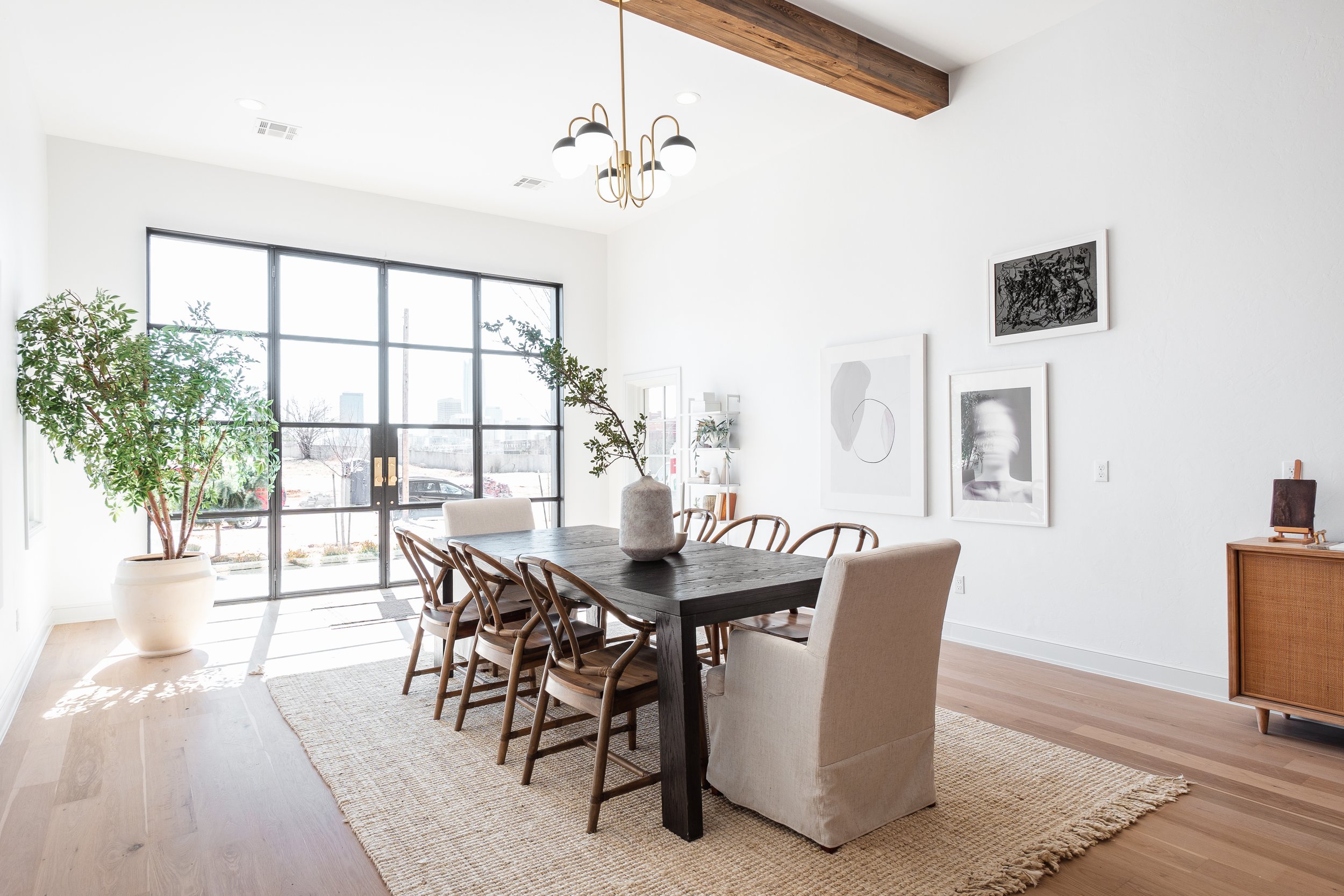
The entrance to the home opens up right into the dining space, so making it feel grand but also welcoming was the true challenge. This expansive, sleek wood table with natural wood chairs gave it a luxe character and contextual cohesion to the open floor plan. A large faux tree brought additional life and functionality to the large space adjacent to the window wall entrance. And I love the fact that I was able to use several of my own art pieces in this space, as well.
-
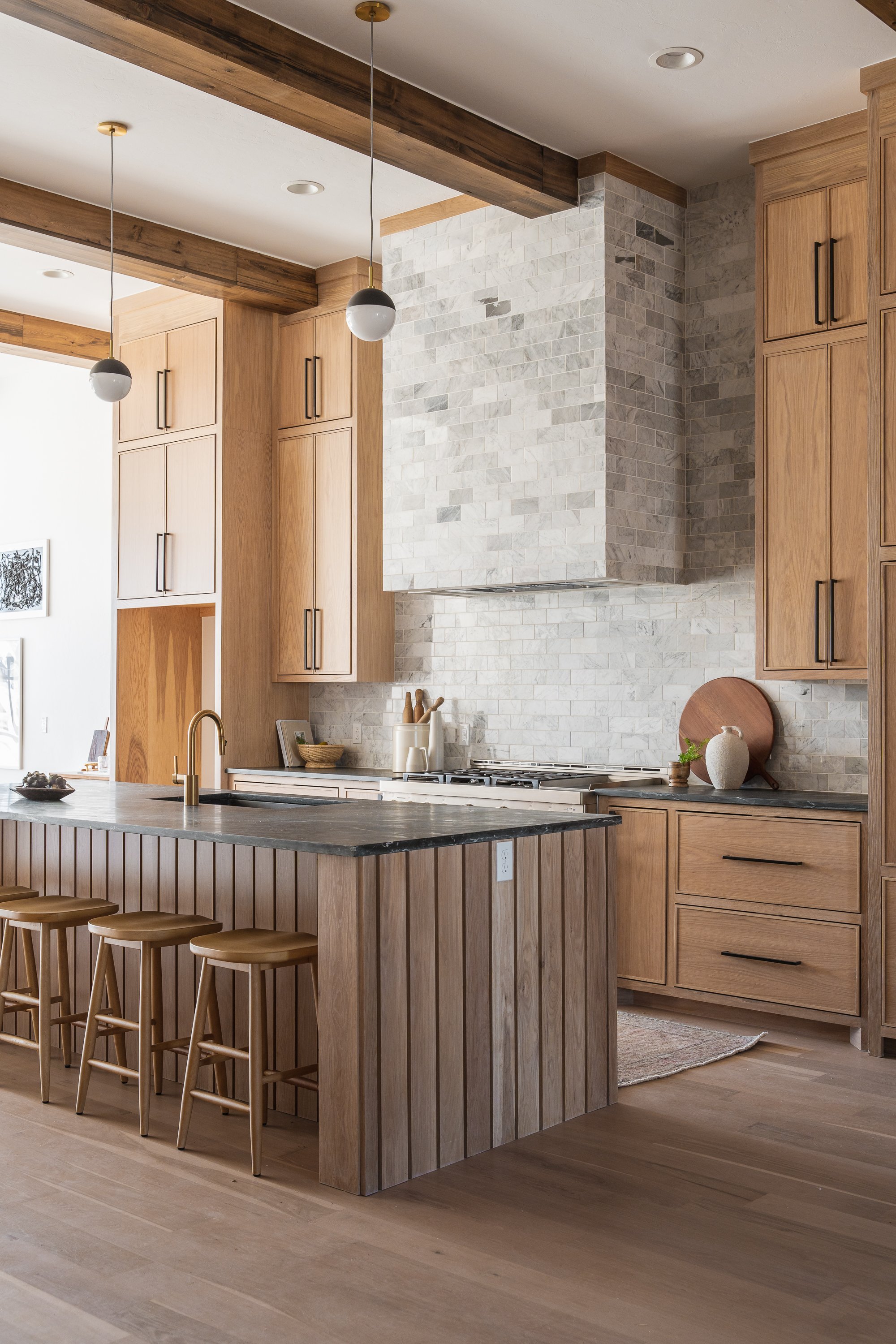
I did not want to disturb the harmony of the stunning natural finishes in this kitchen, and opted for minimal accessories in complimentary wood tones. The soapstone island is the leading role while the accents support and enhance the surrounding finishes.
In another photo featuring the kitchen, I love this view that gives a glimpse through the kitchen into the living space. A vintage runner guides the eye through towards a darker, masculine interior punctuated by bright white forms.
-
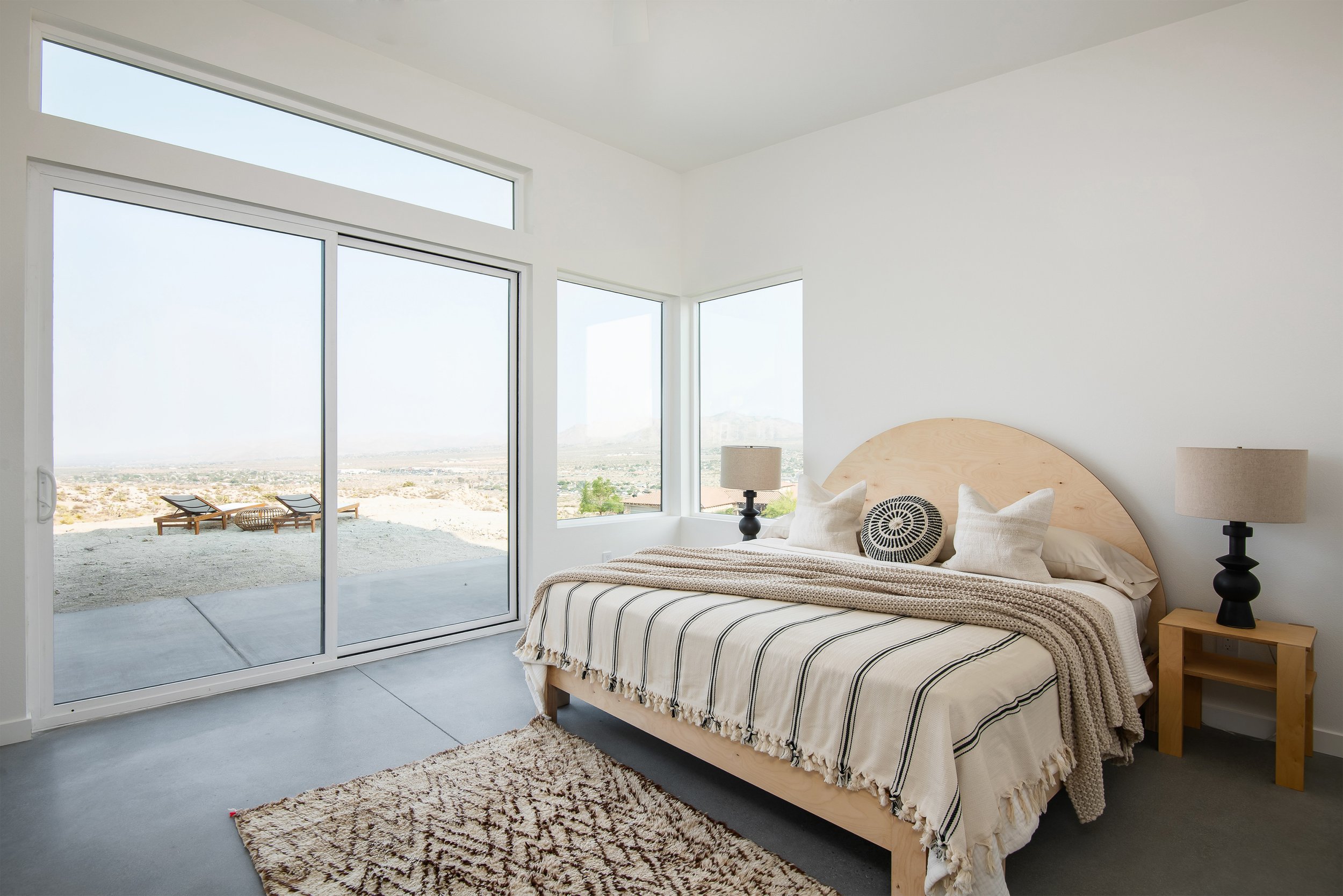
The primary bedroom has one of the best views in the house, and I wanted to create a truly serene and beautiful space to reflect it.
A canopy bed frames the sleep space, while the architecture frames the city. And I love that the addition of metal and glass into this design mimics the urbane makeup. Soft, neutral bedding and a play on proportion with this vintage art print, bring the elegance to an otherwise masculine atmosphere.
-
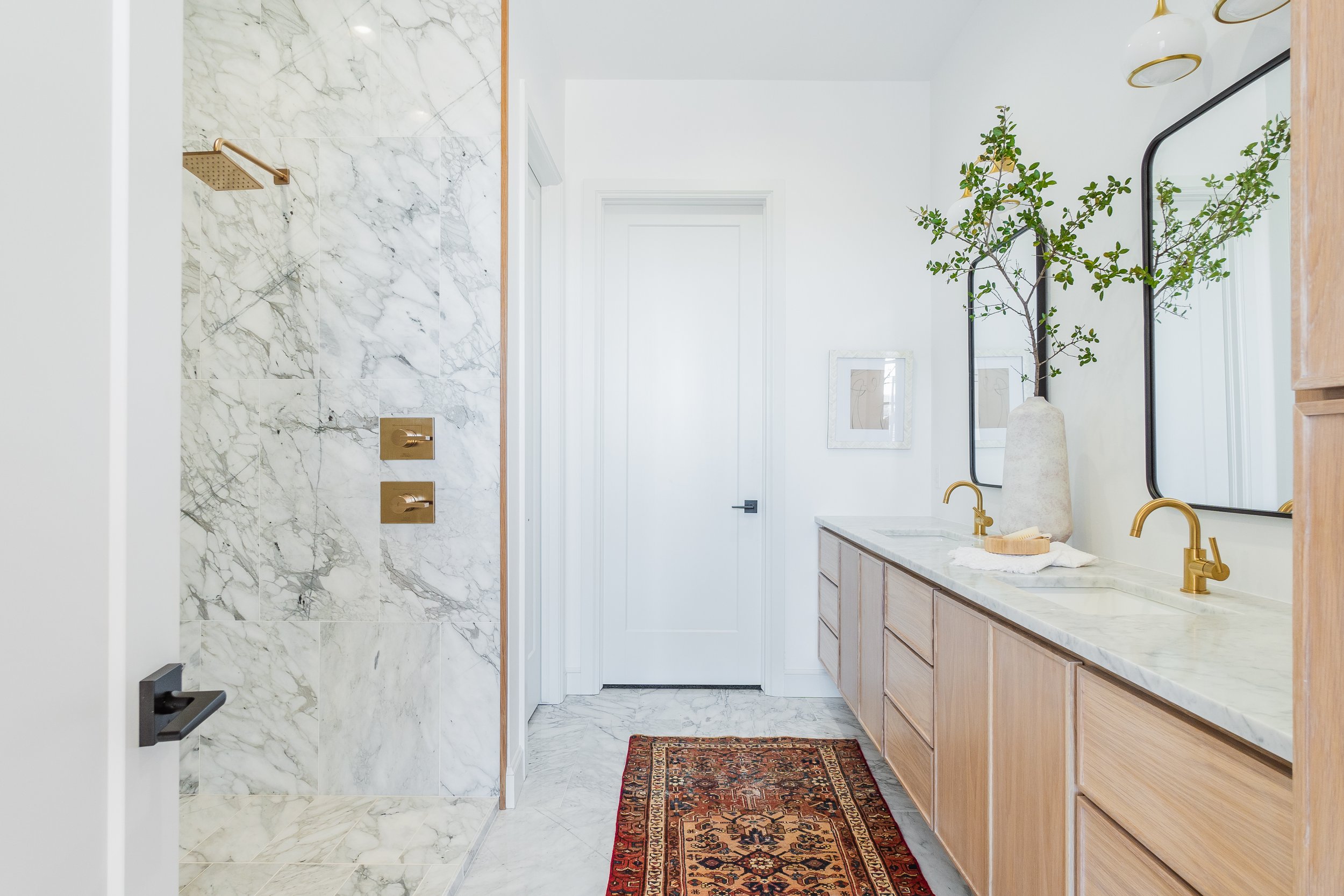
The bathrooms in this home are filled with eye-catching patterned marble so it was important to choose accessories that would not distract from the beauty of these finishes. A ceramic pot with a simple foraged branch offered the grace and touch of color needed to achieve this goal.
-
Another little moment I loved was here under the stairs. I used more proportion play and designer touches to bring sexiness to otherwise wasted space.
-
This home actually has two primary bedrooms; one upstairs and one downstairs.
While the upstairs room opens up to unsullied sights of the city, the downstairs primary suite, in contrast, is intimate and introspective. To really give a variety and capture the mood of each one in it’s own unique way, I decided to do a minimal, draping bed design in the latter. This austere design direction really helped to turn attention to the gorgeous wood accent wall.
-
Our goal was to bring life and depth to this vacant, new construction unit. The unit sat on the market for several months with very little activity prior to staging, and the agent needed a fresh strategy to relist.
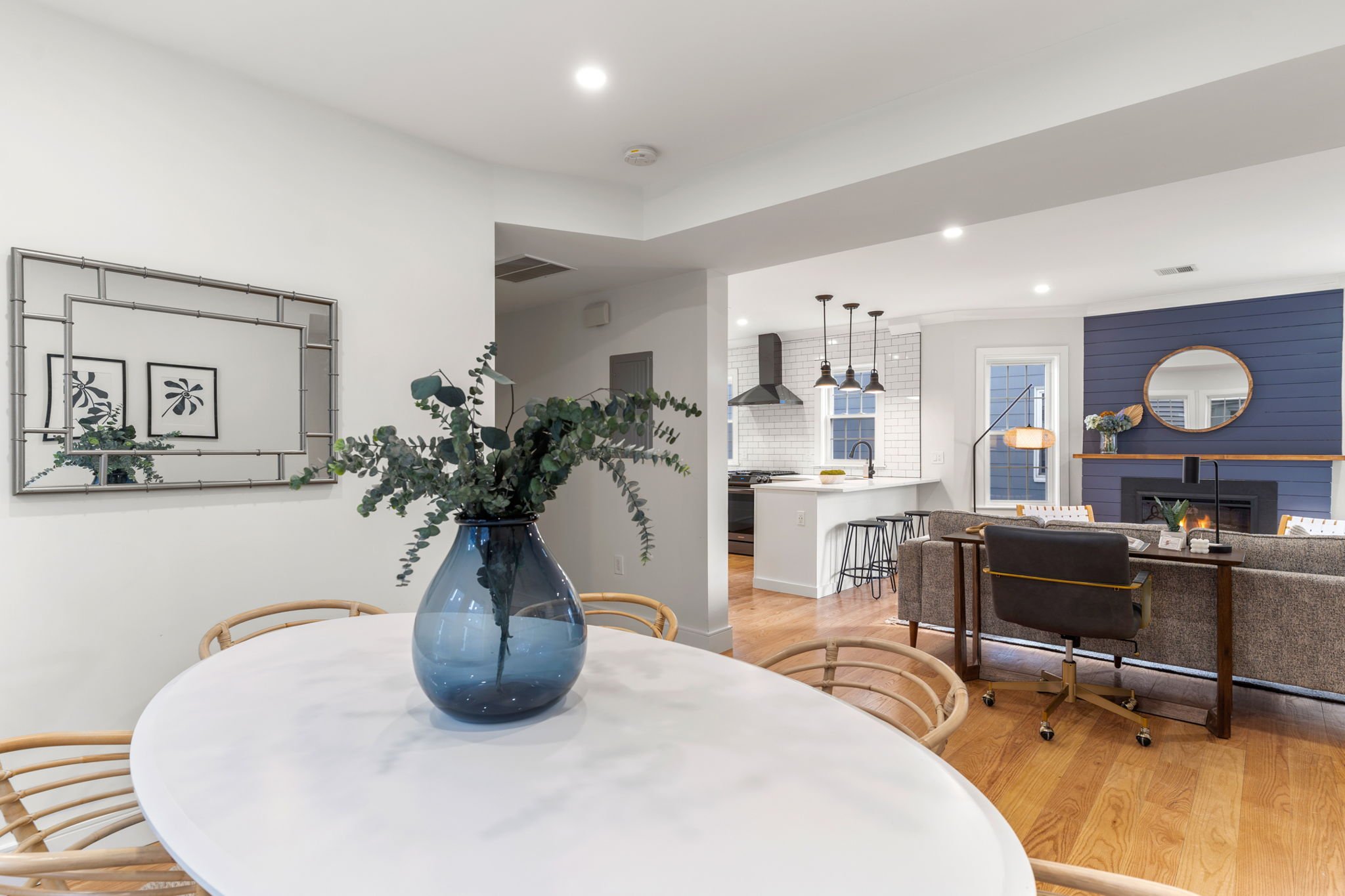
We made choices based off of the finishes, and incorporated walnut and acacia wood tones to highlight the mantle, matte black finishes to tie in with the kitchen hardware, and some blue accents to unify the space with the color of the feature fireplace.
We love to use a cohesive color palette throughout, so that when clicking through images, the listing looks cohesive and well branded. The blue pillow on the bed balances the shot really well.
The agent advised that this neighborhood was attracting both young families as well as empty nesters. We towed the line between modern and classic & comfortable to make a really fresh feeling space that would feel comfortable and inspiring to a range of buyer demographics.
After sitting on the market for months with little activity, the home sold at full ask to the first buyer that walked in the door after staging.
-
Our kitchen styling added color, vibrancy, and depth to photos.
-
A very talented member of my team actually made the flower silhouette art. The reflection of the art series through the mirror is the first things you see at eye level when you walk through the door, so we wanted to create a really memorable first impression with this strategic art placement.
-
The primary bedroom is a really important room to get right. We love how the bed finish relates to the hardware in the rest of the unit and how modern yet comfortable it feels with the added seating area.
-
We always bring accents to soften and freshen a bathroom for photo.


